Nuwa
Rebranding of a health platform

Intro
Nuwa is a rebranding & redesign initiative of Sihaty, a health platform available in Kuwait & Saoudi Arabia, created by The Taken Seat ventures.
The rebranding's objectives are:
Improving the current experience in terms of accessibility, usability & aesthetic.
Modernizing the brand identity of the product.
Introducing new sub-brands and features to the app.
Role
Research
UI Design
UX Design
Prototyping
Tools
Figma
Miro
Notion
Timeline
12 weeks
Styles definition
After receiving the newly refreshed brand identity from the marketing team, I started by researching how to accurately specify product styles, such as colors and text fonts that will be used for the UI.
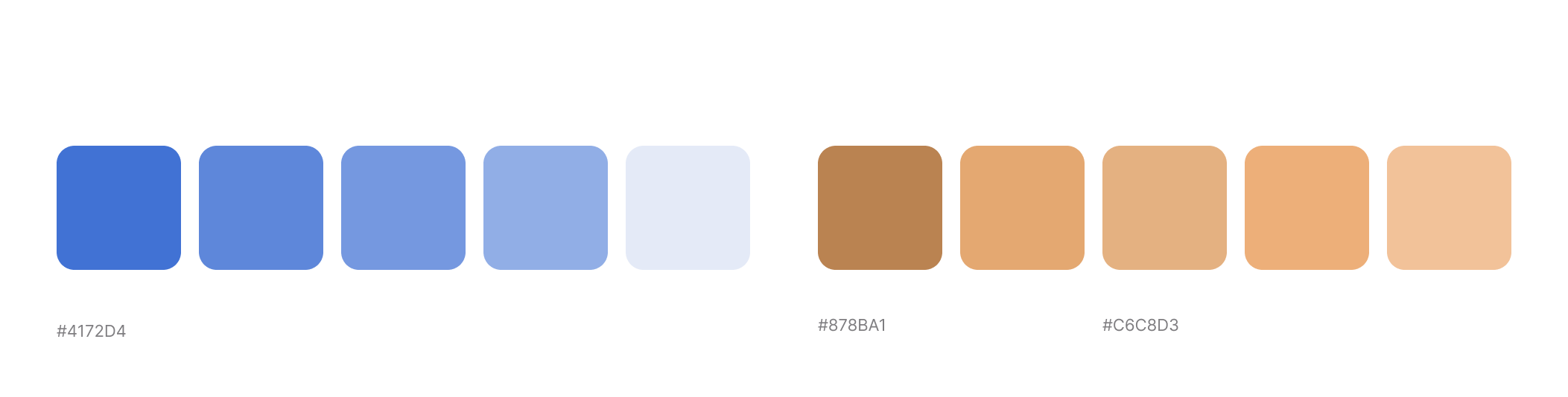
Challenge I
The re-branding introduced a new range of Nuwa sub-brands. The challenge is in establishing a verticalized experience, where the user can easily draw distinctions between the different services of Nuwa. The re-branding adopted a pastel-colors approach, which resulted in an accessibility issue in terms of contrast.
Solution
I proposed making deeper shades of the brand color in order to:
Address the accessibility issue.
Uphold our methodical approach in components states definition.
Apply the sub-brand color to experiences.
And for that particular sub-brand— think of the darkest as our primary.
Please find an example below.
Challenge II
The marketing team has defined two typefaces for the brand. Montserrat For the English version, Almarai for the Arabic version. When I wanted to create dynamic text styles for these typefaces, I faced an issue of font weight equivalence, as the Arabic typeface lacks the needed weights.
Solution
I looked for similar fonts with compatible font weights to address this problem. I then shared these with the stakeholders after designing a table in Figma to emphasize the font weight issue. (As shown below)

Typefaces audit
After we chose the fonts, I used Figma to generate the styles so that we could eventually have a design system that anybody could use, contribute to and straightforwardly adjust to radical changes.
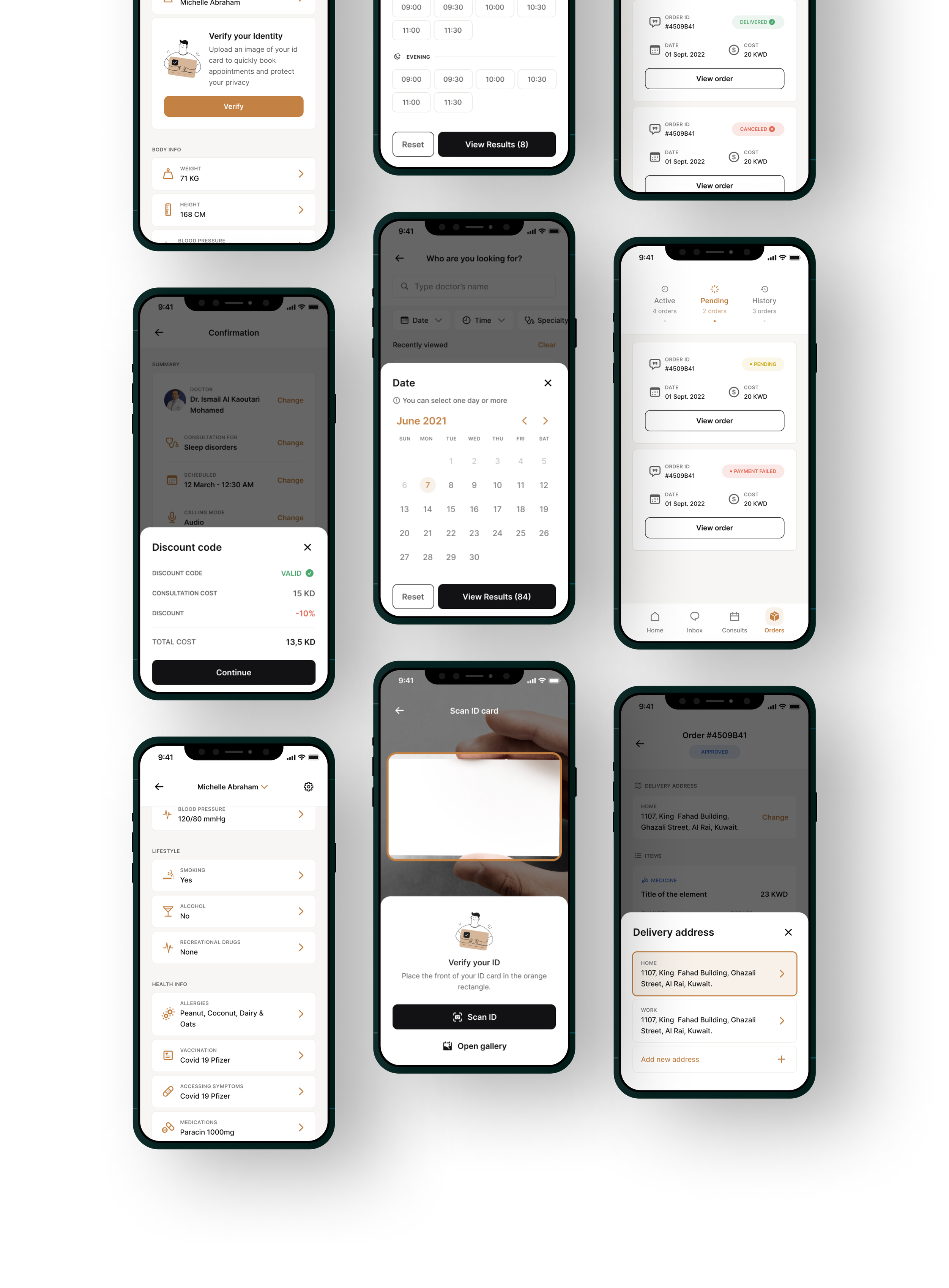
UI Design
The product manager and I re-defined the user flows for each feature in order to understand how it operated and account for every use case in the design through FigJam.
I began creating high-fidelity screens in Figma based on user flows and screenshots from the old application. When a part of the app is finished, it is shared for review with the design team and subsequently with the stakeholders. When a screen is accepted, I transfer it to an other file called "Handoff" so that the developers may comment, inspect at, and export elements.

Onboarding user flow
Screens

Retrospective
Since the product currently exists and the structure won't change much, I had to compromise my freedom to think of new solutions and being creative. However, it turned out that I encountered several problems that called for original thinking in order to be solved. I came to understand that being creative does not necessarily need starting from scratch.
I was really fortunate to be a member of a design team that regularly gave me feedback and supported me along my path. The product manager with whom I had the opportunity to work was also very cooperative and team-spirited, which fueled our determination to complete this mission.
As a UX designer, you would want to get all the materials complete and prepared for use in developing UI deliverables, but in reality, it is our job to define the final branding materials that are ready for usage. Collaboration between the two parties (Graphic designer & UX designer) is necessary to bridge the gap between branding and UI design.