Avito
Building a consistent platform
Context
Avito was launched in 2012 as a startup. It then grew to be Morocco’s number 1 Classified Marketplace with over 6 million users every month. Their users can buy and sell on the Web and mobile (Android and iOS).
Problem Statement
In terms of product design, Avito’s rapid growth was unstructured i.e, lack of a design system. This led to severe user experience inconsistency across platforms.
Responsibilities
I was part of a cross-functional team that had weekly meetings to sync about this initiative. And my duties varied from research, definition, UI design and documentation.
The Process
The process followed when solving this problem consisted of 3 phases, below is an overview of the latter:

Research
To better understand the different problems in our product, we conducted interviews with people from different departments (Front end developers, Product Managers, Engineering managers, Marketing manager…).
After these initial interviews, we discovered that we need to:
Identify all the design issues in our product
Learn the common standard and principles of a successful design system
01. Visual Analysis
We started by auditing our product on different platforms; i.e, we listed out all instances of particular components (Buttons, dropdowns, input fields…) on the different pages and flows (Image 1). In addition, we interviewed a couple of front-end developers and designers to understand their main goals and pain points.

Image 1
Key findings :
Inconsistency
As you can see, our product had many inconsistencies, be it in colors, components, guidelines…, which can have detrimental effects on the overall experience & the brand image.Redundancy
For designers, not having a library of components means you’ll have to do repetitive design work to create your product screens. This also applies to the implementation, since developers would have to spend more time and effort to create new components.“We don’t have a clear theming for our semantic components (Errors, Warning, Confirmation…)” Ayoub — Engineering Manager
“I can’t re-use a component from another project, since they don’t have a similar structure.” Omar — Front End Engineer
Rigidness
Nonexistence of a buttons’ hierarchy nor a clear structure for the different states of the components used across platforms.
02. Benchmark
In the benchmarking, we deeply analyzed the documentation of the guidelines and the components of popular design systems.
Key findings
As an outcome of the benchmark, we found out that these popular design systems share some common principles. Based on our needs, we picked 3 principles as the pillars of our design system.
Accessibility
For a product that’s used by millions, we need to accommodate our different types of users, including the ones with visual, auditory, and motor impairments to create inclusive experiences.Flexibility
The systems’ modularity ensures maximum flexibility in execution. Their components are designed to work seamlessly with each other and in whichever combination suits the needs of the user across platforms. Also, when it comes to color theming, Google Material has practically approached this through their *principles of color,* which is aligned with our long-term vision of verticalization.Communication
Commonly, a design system should have a consistent structure in which textual elements and feedback messages are formed. More than that, it should have a library of illustrations that are user friendly to strengthen the brand’s feel within the product and help convey complex ideas in a simple way.
03. User Research
Part of our company’s values is being user-centered. For that, we attended a weekly meeting to discuss and stay updated with the user feedbacks that come through different sources, e.g. NPS, reviews on app stores, customer service reports, Hotjar surveys, or yearly workshops (as you can see on the image).
Key findings
One of the most frequent user feedbacks we got is related to the UI. Users found the visual aspect of the products to be outdated.
Definition
To learn the proper approach for the definition of the structure and guidelines of our components, we set up a team of designers and engineers. Our high-level objective was to have a set of elements that could coherently co-exist within a larger system, which is why we adopted the Atomic Design methodology.
Atomic Design
As Moroccans, we take huge pride in our traditional culture. Part of that is the famous style of tiles. Building a wall of traditional tiles starts with putting smaller and smaller pieces together. And this has inspired us to name our Design Language System Mosaic.

Building the structure
For our application of the Atomic Design approach, we used Notion to list out the entire components that are used on our platforms in a table and organized them into an initial structure of atoms, molecules, and organisms.
We started with atoms, the smallest units, that will be the foundation for our design system; namely typography, colors & spacing.
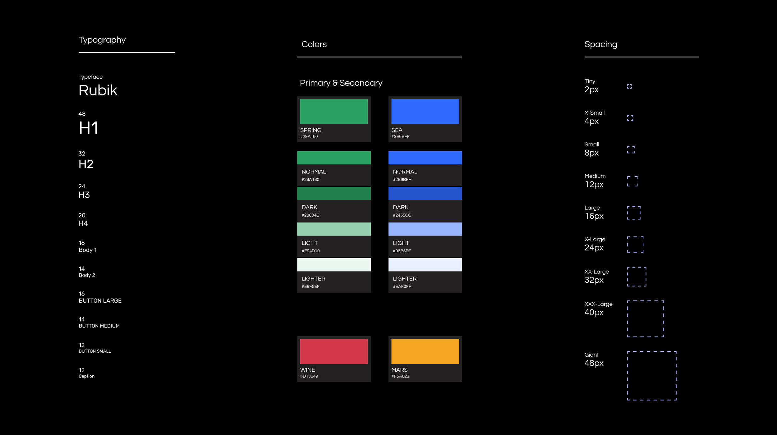
As mentioned in the benchmarking section, Avito has a long-term vision of verticalizing the platform into dedicated experiences for Cars, Real Estate & Miscellaneous… In order to achieve that, we followed an approach that allows us to derive color variations that express the different states and interactions in a consistent way across the verticals in our products.

As a result of this method, we can systematically generate a consistent color palette for all our different products and use cases.
Design
Creating Components
For the creation part, we made sure that each of our components is:
01.Accessible
For that, we needed to evaluate the combination of text and background color based on the WCAG recommended ratios. High color contrast helps users who are partially or completely color-blind see differences between certain colors. It creates a strong visual hierarchy and improves usability for everyone. More than that, we are using all caps style for characters on CTAs as well as a comfortable character spacing to enhance accessibility.
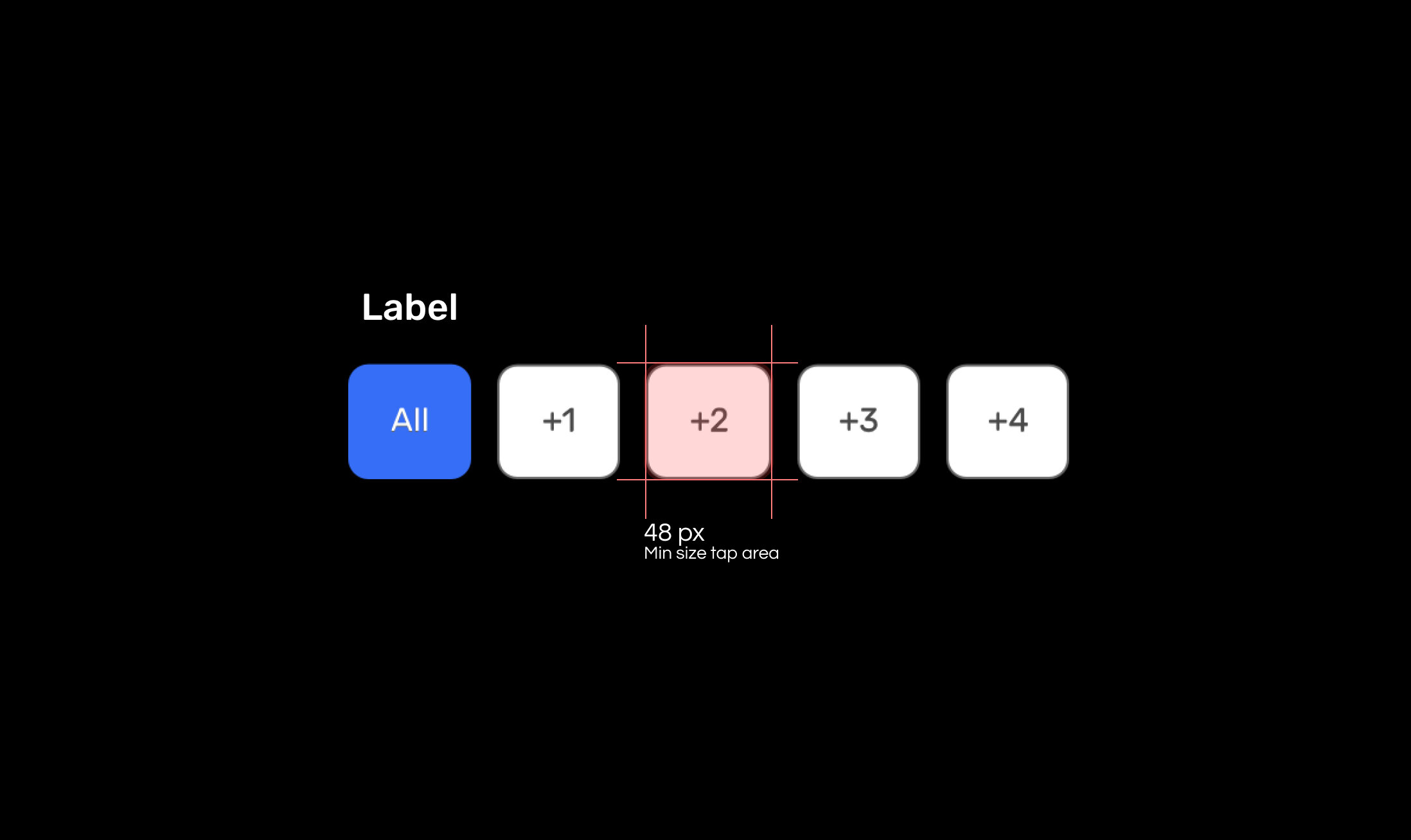
Minimum size on Mobile is 48px for a more accessible tap area
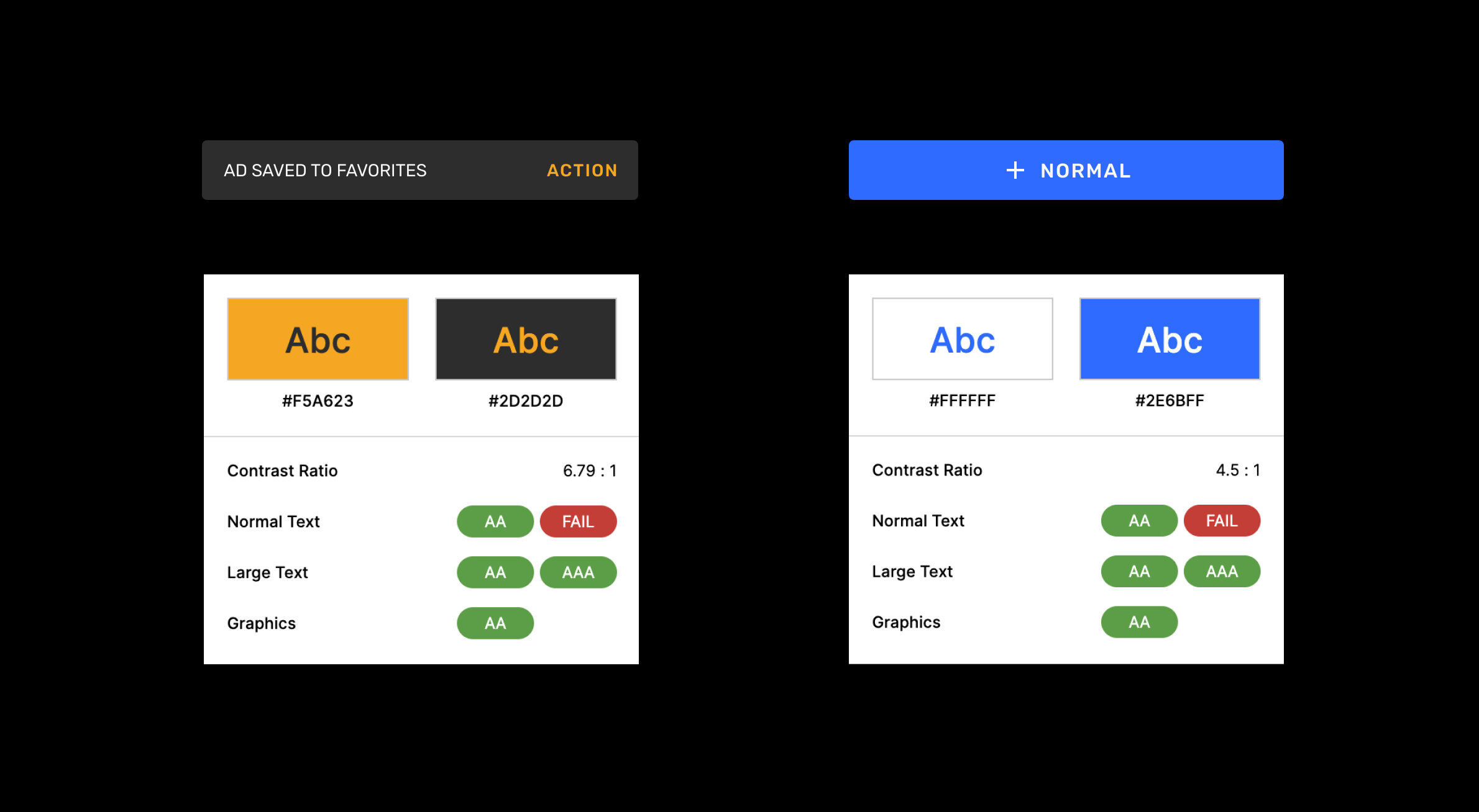
Color Contrast ratio check
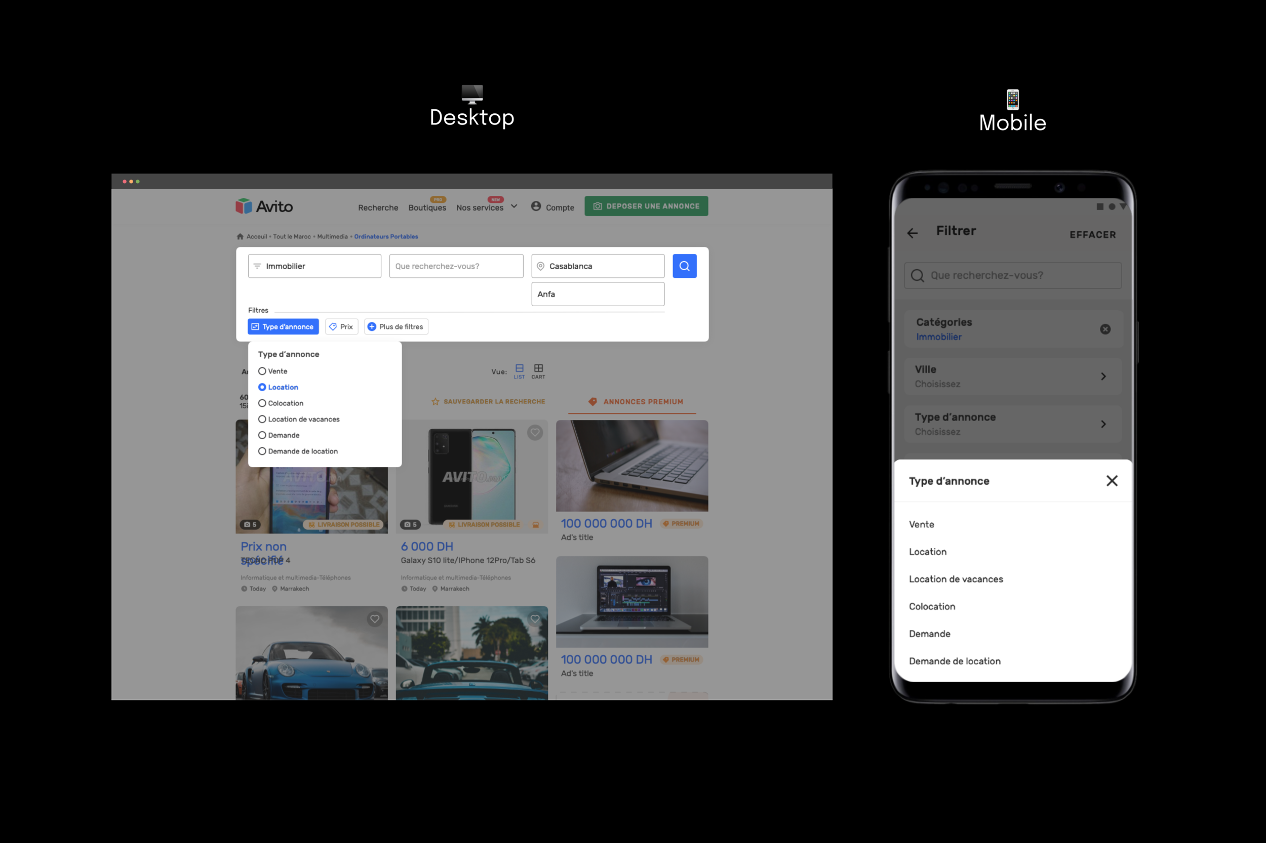
02.Intuitive
To have an intuitive experience, we are following the adaptive design approach. This means that our components are platform-friendly. For example, the drop-down component is made especially for the desktop platform. Whereas, for the mobile, the equivalent is the bottom sheet.
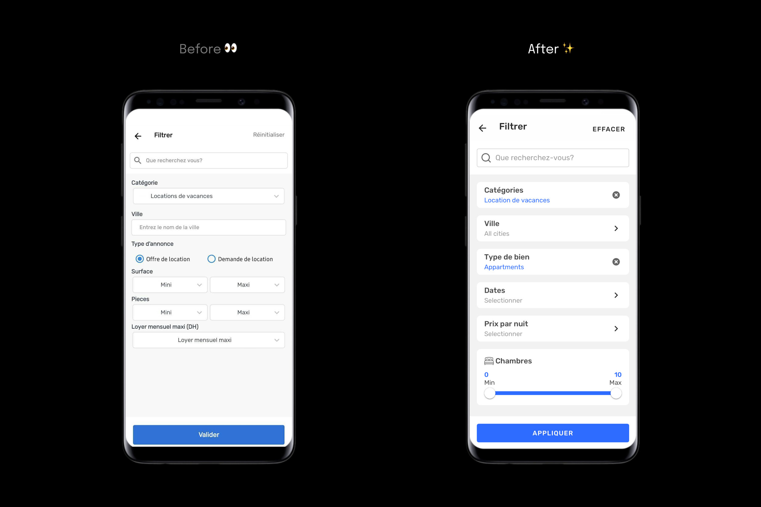
03.Aesthetic
Stepping up our UI game is a must according to Jakob’s law, since the websites and applications our users use frequently have a modern visual look. i,e. clean and minimal design, rounded corners, vibrant colors, smooth shadows…
Users spend most of their time on other sites. This means that users prefer your site to work the same way as all the other sites they already know. — Jakob Nielson
Organization
The way we organize our components is dynamic, which means that the components we use in interfaces should be inherited from one main Sketch library hosted in a shared Drive folder. That way changes applied to a component in the library will apply to all instances of that component throughout our project files.
For example, all our buttons are inherited from 1 main symbol. This parent button is created to support the different use cases that may occur in our product, including the hierarchy of buttons (Primary, Secondary, and Tertiary). Not only that, the parent button can also be adapted to the different color themes of all our products.
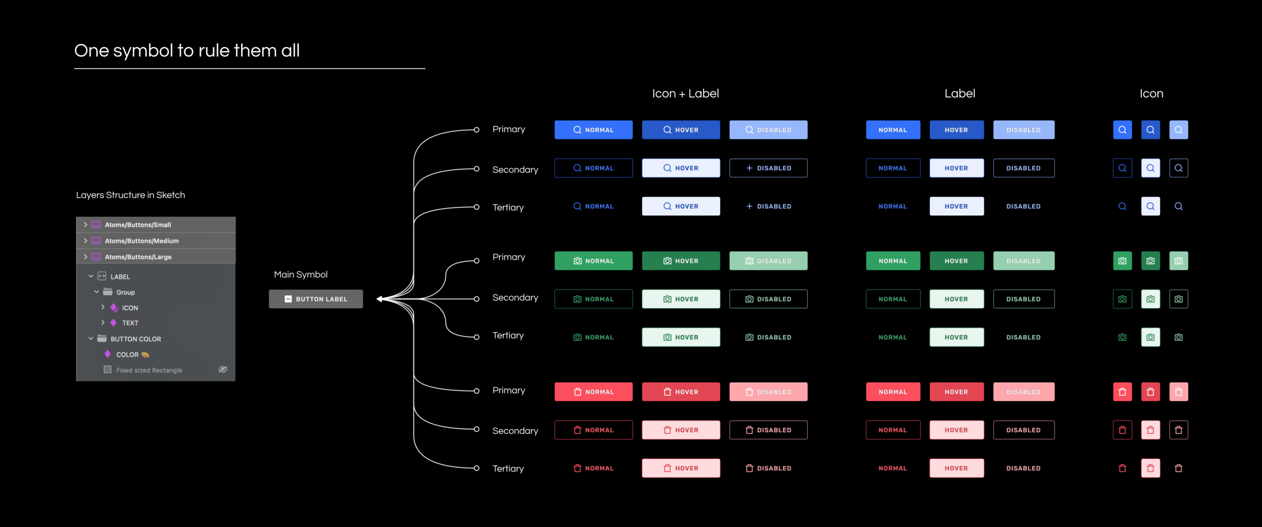
For example, all our buttons are inherited from 1 main symbol. This parent button is created to support the different use cases that may occur in our product, including the hierarchy of buttons (Primary, Secondary, and Tertiary). Not only that, but the parent button can also be adapted to the different color themes of all our products.
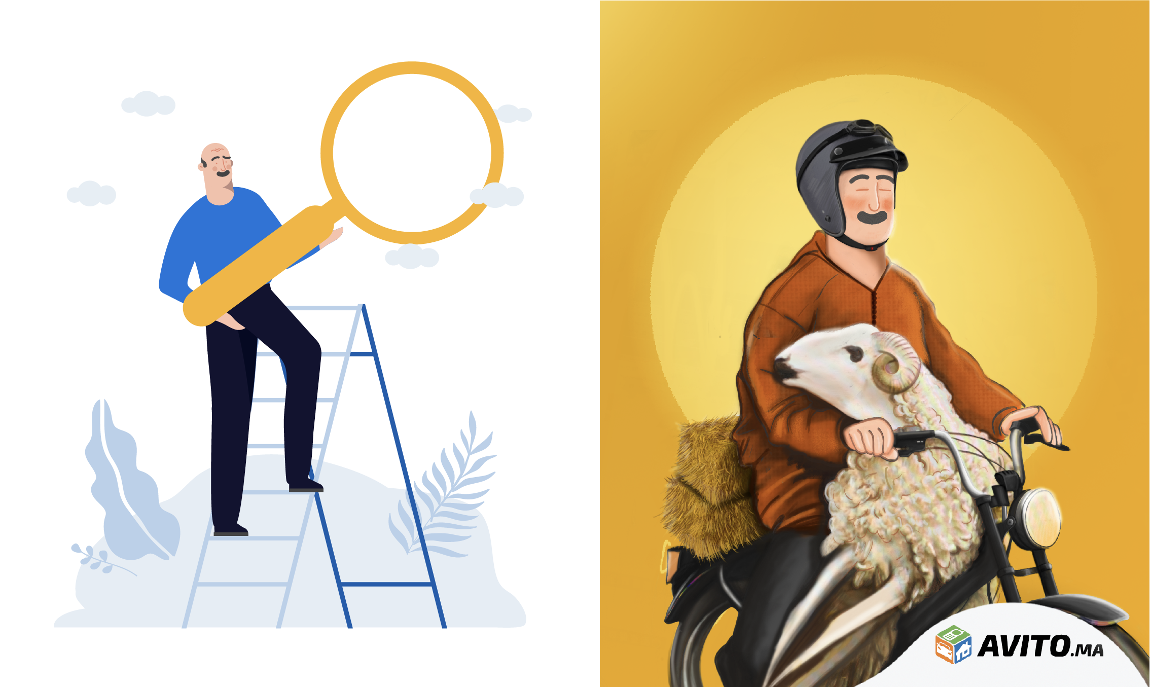
Brand Illustration

Problem
Our brand had an inconsistent style of illustrations, be it on product screens or in a Marketing campaign. We were using different kinds of illustrations that we purchase from online resources like Shutterstock and Envato. To bridge the gap between Product and Marketing, we thought of creating our own library of illustrations.
How we solved it
We thought the best way to make our illustration more relevant is by building a set of characters that match the type of users we have on our platform. Our illustration characters were built based on the 8 types of Marketplace users. The research behind the segmentation of users was done by our central team. Each character has their own type of buying and selling behavior.

When it comes to the visual style, we organized an ideation session to explore ways of creating our character illustrations. We ended up choosing a style that combined the modern and the traditional style.

Artwork by Hiba Widadi
Guidelines
Similar to any other element in the design system, illustrations are also subject to a set of guidelines that guarantee their proper usage within the products.
The following is an example of the guidelines.
Do ✅
Use primary colors to put the main elements in the foreground.
Don’t ⛔️
Do not use primary colors on all visual elements.
The end result
We designed our set of characters in a flat style with soft colors, as these work as a supportive element that helps clarify an idea or help the user complete a certain task. For Marketing, the same set of characters are used in a different style that has more visual details and vibrant colors to catch the eye of our audience.
Product Illustration (Left) - Social Media Post (Right)
Impact
Working on our design system has been very challenging, but it has brought about many positive benefits for the company on different levels.
For us :
Development
This simplified the life of developers. Speaking one language with the design team when discussing implementations. Focus on the feature not the low-level UI primitives (color & space values, small components, interactions, states, etc).Design
Having a ready-to-use library of components made creating high-fidelity interfaces a straightforward task by bringing designing interfaces from days to a couple of hours.Experimentation
The design system allowed us to quickly build prototypes, test more ideas than before, quickly evaluate our hypotheses, and even create more variations to A/B test.
For the user :
The points mentioned above are all related to internal aspects of the company, whereas the sought impact can be seen in the improvement of our user experience.

The Android rating average evolution by time is an example of this impact.
Of course, this impact was accompanied by other initiatives and the amazing collective efforts of the different departments.
Reflections
The process of solving this issue has been a major learning ground for both of us. We are not experts in building design systems, not just that, we are new to UX Design and most of the principles and techniques mentioned in this case study were learned on the go. However, we experienced many challenges that allowed us to improve our soft and hard skills. Here are a few of the challenges:
Limitation of time and resources
Considering the bilingual property of our components since our product is available in 2 languages.
Getting everybody on the same page and working together as a unit. Coordinating between designers, developers, and other stakeholders.